So, finally you have decided to develop your own layout plan for your print project? Great! You are on right track! It's something like to develop a plan of your home or society. How it will look like? how to design? The main entry, green area, roads, connectivity, floor map of buildings, playgrounds, etc. In print project also you have to plan, how to describe your first page, overall layout look and feel, white spaces, colour planning etc.
Let's discuss few and but important elements of the layout designing which will help you to design better layouts of your design.
Alignment: How to align objects?

As the name indicates, it's all about how should we place text, images and other elements within the design. Alignment can be flush left, flush right, justified or centred. Flush left and flush right is sometimes referred to as left justified and right justified.
Bullets: How it can highlight message

A common character, usually used to draw attention to listed items or to show the hierarchy of various points. Popular bullets type is round, but it can be squares, diamonds, triangles, arrows, check boxes, check marks, stars, and other shapes. You can add bullet by your applications. You can insert bullet points at any applications, if it is notepad, browser search box by simple method:
TIP: Press & hold the ALT key on your keyboard and enter a number (any one from 4, 7, 8, 9, 10, 16, 175, 249, 250, 254, 0149) by numeric keypad at the extreme right of your keyboard (not the number keys below the function buttons), then release the ALT button.
Body Text: The main matter of your design

It is he main section of a book, brochure, newspaper article, or other text material. The is size of body text across the table should be same for the design consistency.
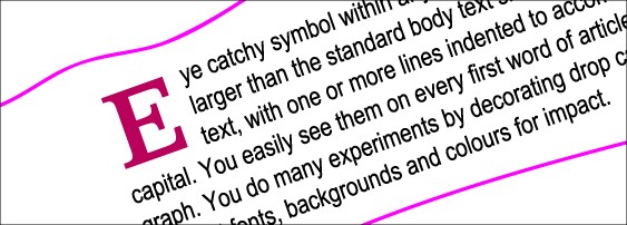
Drop Cap: Eye catchy symbol within any text blocks
A single letter, larger than the standard body text size, set into a block of text, with one or more lines indented to accommodate the capital. You easily see them on every first word of article or paragraph. You do many experiments by decorating drop caps with different fonts, backgrounds and colours for impact.
Folio: The label of each page and section

Folio is the main element of indexing a book, newsletter or booklet! A common term for the page numbers which could also include name of book or section for readers to use easily. Neat clean and user friendly folio can inspire reader to read more in sequence.
Hyphenation: How to handle long words?
With hyphenation you can set the guidelines how you big words will look like? Dividing words by leaving part of the word at the end of one line and continuing it on to the next, with a hyphen at the end of the first part of the word. Many words have their own rules for hyphenation that are not consistent with the general rules of the language, and must be hyphenated according to an exception word dictionary.
Indents: Good idea for paragraph style?
 By indent style you can set your text block accordingly to your overall style instead of manual spacing. First line of a paragraph can be indented so that a margin of the line or lines appears a fixed distance from the left and/or right margin. You can indent left, right or last line for accurate margin. You can use first line indent for first line of the paragraph and left indent for bullet points.
Leading: Can lead good layout?
Leading is not a tough subject to understand—it is the spacing between lines of text. It is generally measured from baseline to baseline and expressed in points. Leading affects text's appearance and readability. Some fonts read better with increased leading due to long ascenders and descenders. In consumer-oriented word processing software, this concept is usually referred to as "line spacing" or "interline spacing."
Kerning: Key element good typography?
In design, kerning is the process of adjusting the spacing between characters in a proportional font, usually to improve the aesthetic appearance of most words that are set in all capitals especially in large display and headline text lines. Here we have discussed how to design regarding layout.
Feel free to put your comments below!


No comments:
Post a Comment